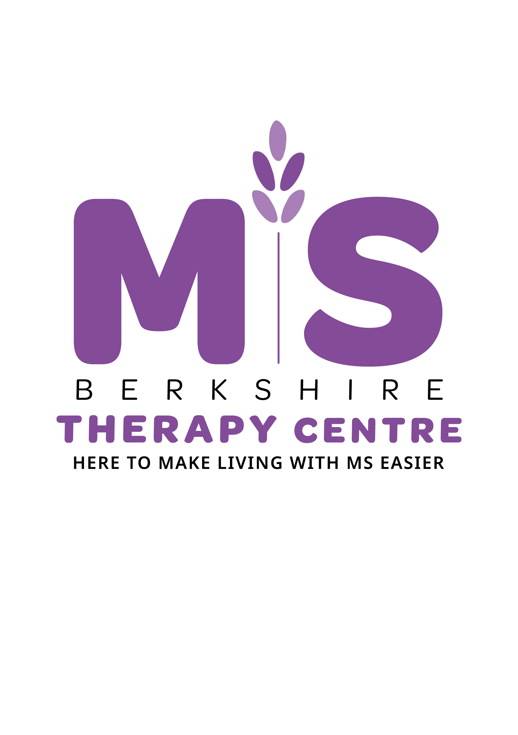
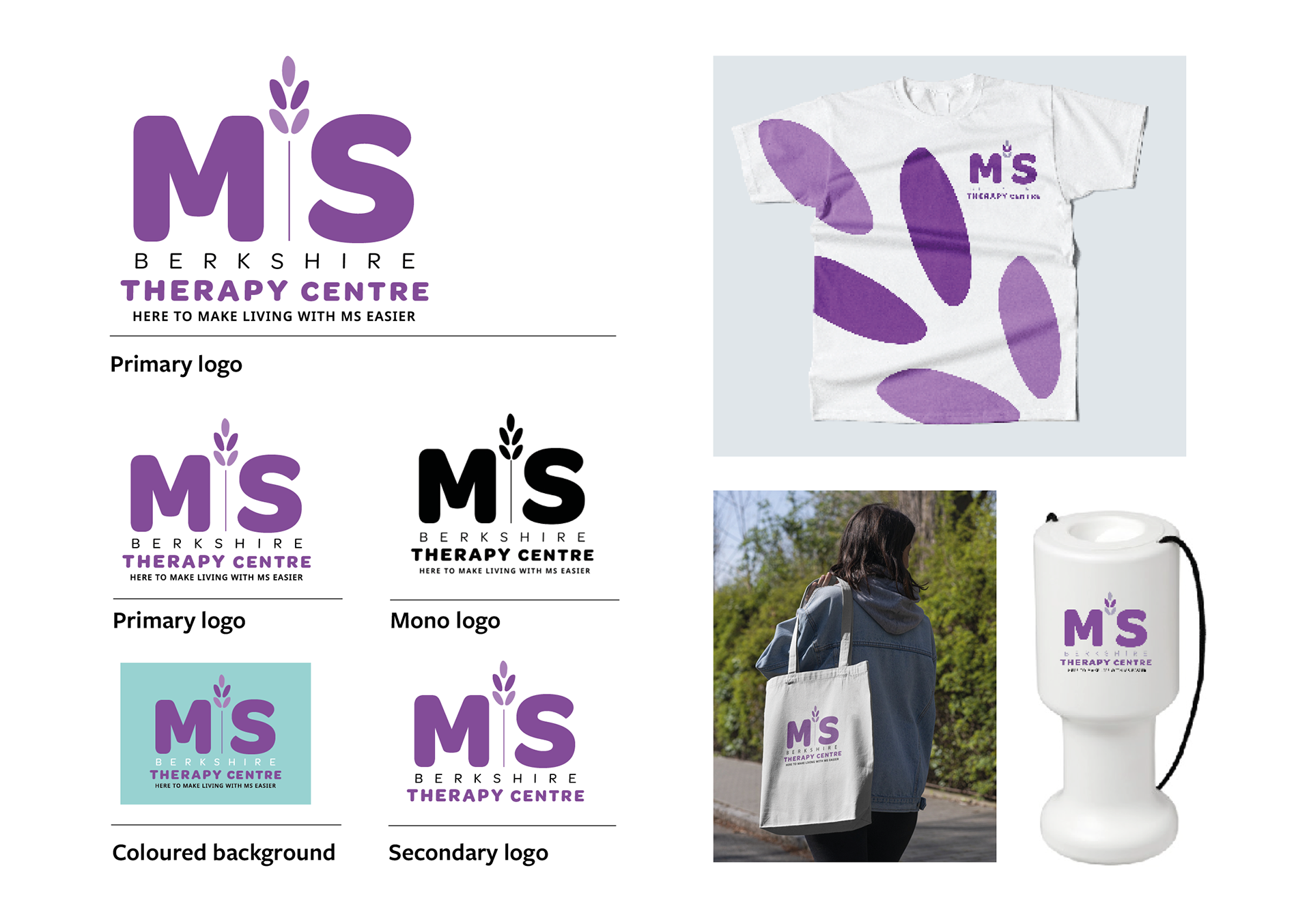
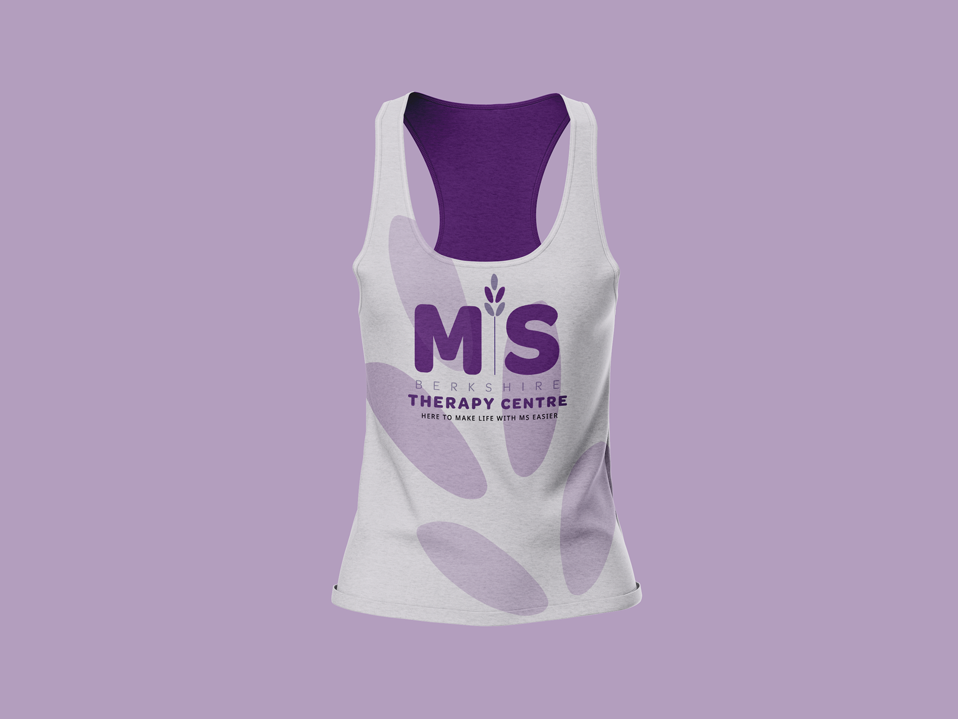
working within a group we were tasked to rebrand MS THERAPY CENTRE BERKSHIRE. WE FELT THEIR CURRENT BRAND DID NOT EMBODY THEM AS A CHARITY AND SO WE WANTED TO PARTICULARLY FOCUS ON THIS ELEMENT IN OUR LOGO.
UPON VISITING THE CENTRE WE immediately GOT A SENSE OF COMMUNITY, ALONG WITH FEELING CALM AND RELAXED. The therapy rooms smelt of lavender hence the use of it within their logo. we also felt this took them away from the generic field of charity logos, especially in the ms scene.